Designing your fundraising t-shirts
T-shirts create awareness, communicates identity, serve as a lasting symbol of your passion for a cause. Most of all they are fun. And that is why they make a good fundraising idea. At Create A Tee, we offer an online platform specifically designed for this purpose. We enable an individual or organization to create an online campaign for the purpose of fundraising and creating awareness through sale of custom printed t-shirts. This comes without need for inventory, upfront capital and logistical hassles.
However it is to be noted that for such a fundraising campaign to be successful the message and graphics on the t-shirts are really what will ultimately drive supporters to take action and purchase. So how are you going to design a killer image without spending thousands on buying images? In this article, we’ll give you t-shirt design tips and tricks you can use to not only create a great looking t-shirt, but to also increase the effectiveness of your campaign and reach your fundraising goals.
1.Symbolic design.
Create symbolic designs to resonate with a broader audience. Designs are often the best way to achieve success with your fundraising campaign. A symbolic design tends to resonate with a target audience. It also improves the wearability of your shirt beyond just a single event or date.
Instead of creating a t-shirt that loudly proclaims “SAVE CHICKEN LIVES 2016: August 15 to 17” in bold text, consider a simpler, more symbolic design. You could create a guitar emblem or drums logo with smaller text underneath. That way, people won’t feel like they’re only buying a t-shirt to wear between August 15 to 17 of 2016.
The exception to this rule is if you hold an annual event – then it is encouraged to “brand” each year to establish some “bragging rights” between event participants.
Most people don’t want to buy your shirt to wear once. They want to buy a shirt that they can wear multiple times. A shirt with a symbolic design tends to be more multi-functional than shirts with a single, specific design.
With a symbolic design, you can also easily cater to men and women of all ages. Your symbolic design can be just about anything, but with a little bit of tweaking, you can customize it to appeal to multiple demographics.
2.Keep it simple.
There’s this repeated sayings about shirt design that goes : detail is important, but simplicity is king. In other words, your shirt should be detailed enough to convey a unique message, but simple enough that the message is easy for anyone to understand. Simplistic shirts will resonate with your targeted demographic, but they’ll also help convey a message to people who aren’t yet aware of your campaign. Once again, you get to connect with a broader audience without confining your shirts to a tiny niche. Whether it’s a cancer fundraiser or a charity run, a simplistic shirt design can quickly and easily spread your message to a large audience. Simplicity often means limiting the designs to a certain area of the shirt without making the rest look too “crowded”.
Is your shirt simple enough? Consider this: could somebody look at it and understand its basic meaning in less than three seconds?
3.Don’t use dark design when on dark shirts, it makes the shirt unreadable.
This may seem obvious but for some reason, people often forget this tip. Dark design will simply not show up on dark fabric. We can’t count how many un-readable shirts we’ve seen which feature dark text on a dark background. A good rule of thumb is your shirt’s text should readable from 15-20 feet away. Dark text on a dark background could be unreadable from five feet away – which is why you need to avoid it at all costs. Always put light text on a dark background (or vice versa). Unless, of course, you don’t want your shirt’s message to be read!
4.Rotating the text.
Flat, straight text on a shirt is certainly fine. People can easily read your message without a long glance. But to make things more interesting, consider rotating text or using a creative (but readable) font. Rotating the text in your design can make it more aesthetically pleasing & eye-catching. Some people will simply ignore straight, flat text, but if you rotate that text around or make it interesting, it begs the eyes to continue reading. Obviously, there are limits to this. Sideways text usually isn’t ideal for readability, and cursive fonts can be nearly impossible to read when printed on a t-shirt.
5.Avoid using photographs (unless you are a celebrity).
Shirts with photographs or images tend to look tacky. Some people try to place a photograph of a loved one’s face on a shirt, for example. These shirts rarely reach their fundraising goals. Image-based shirts – particularly when they feature people – can look awkward. Up above, we talked about the importance of abstract or symbolic designs. Instead of using a photograph of a specific person, place, or thing, use a symbolic design to represent that person, place or thing. Don’t use photographs or images on your shirts unless you have a specific target or goal in mind.
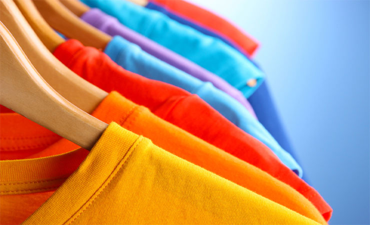
6.Take advantage of complementary colors.
Let’s talk about colors, because they’re the thing people will likely notice first about your shirt. You have a few color choices to make on your shirt, including the color of the shirt itself and the colors of any designs printed on that shirt. Ideally, the colors you choose will be complementary. They’ll look good together and mutually enhance one another. How do you find complementary colors? Using the color wheel (wiki reference) of course:
To create interesting contrast on your shirt, use complementary colors. Red and green are complementary colors. So are purple and yellow. These colors create heavy contrast but can be extremely effective marketing tools when used intelligently (i.e. don’t overuse contrasting colors unless you want to give people headaches). Instead of recommending specific colors, we encourage you to check out Adobe’s Kuler tool. Kuler is a fantastic way to quickly “preview” different color harmonies and can cut a lot trial and error design time.
7.Include colours related to your cause.
Still having trouble picking a color? Choose a color relevant to your cause.
some causes are instantly associated with a particular color. Breast cancer and the color pink have long been associated with one another, for example. The same can be said for the color red and HIV/AIDS awareness. You can go with the classic country colors of red, white, black and green, for example (Kenya).
8.Balance your design.
Pay attention to the symmetry and focal points of your shirt to ensure a professional look. The balance and focal points of your shirt are extremely important when you’re trying to quickly convey a point. Of course, a nontraditional approach would be to create an unbalanced design, where your shirt is neither symmetrically balanced nor asymmetrically balanced. Shirts like these can cause unease in people who view the shirt, and it can leave the shirt with an “unfinished” appearance. Unless you have experience designing shirts and want to try something new, I recommend using a symmetrically balanced or asymmetrically balanced design.
9.Don’t forget about focal points
Focal points are also important. A focal point is the place where most people who see the shirt will look first. The best shirt designs create focal points. The eyes are naturally drawn to the most detailed shape on the shirt. The area with the highest concentration of colors and lines is typically where we look first. You can create a focal point using colors. Vibrantly colored areas with lots of detail are ideal focal points – especially when the rest of the shirt features more neutral colors and lighter patterns.
10.Use popular design trends.
Leverage design trends and iconic graphics to create a stylish & hip shirt. (Keep calm….) There are all sorts of different shirt designs you can use to create your shirt. If you’re a creative individual, then you may want to branch out on your own and create a cool, unique design. Most people, however, would rather build off the work of other shirt designers, in which case you should consider some of the following popular designs and trends:
Faded colors and vintage-style font
Simple text with a play on words
Distressed effect– give it a worn-in, comfy look.
Designing an awesome shirt isn’t rocket science. It’s easy to overthink things when really you should be keeping it simple. You can use our online t-shirt designing tool to create your own custom design for free.
[embedyt] http://www.youtube.com/watch?v=EcDnu26LLFo[/embedyt]